The novel coronavirus completely knocked the wind out of the sports world, but one of my favorite elements of the games has remained: uniform reveals.
During the past couple of months, multiple professional and college teams have released new kits. It is always a joy to see tweets for and against the changes and debates that commence thereafter. While there’s limelight on uniform designs, now is the perfect time to look back on some of the changes the Miami RedHawks have made to their sets.
Football:
While the team’s story of the year was winning the Mid-American Conference Championship, it also took a few steps forward in its looks.
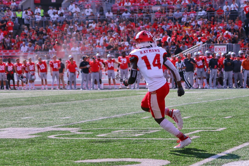
This was a big year for helmets. It was the only substantial change for the RedHawks, but it made quite an impact on how the team looked on the field. Miami started with the clean and classic Beveled-M, but as the season progressed, so did the designs. As they did last year, players were able to choose a color that represented a type of cancer they wanted to raise awareness for during Miami’s annual cancer awareness game against Northern Illinois. Like years past, some helmets were auctioned off with proceeds going toward Swoop’s Stoop, which helps children in need at Cincinnati Children’s hospital.

Heading to Athens, Ohio, to face Ohio University on the 150th anniversary of college football’s first game, Miami decided to class up the current set by applying the new universal “script Miami” to its red helmets. The RedHawks won and kept this look for their red helmets for the rest of the season.

The Miami RedHawks will be back in uniform on Nov. 4.
One week after beating Ohio, the team did it again by featuring a helmet with logos from the Myaamia Heritage Collection. The Heritage Collection is a collaborative initiative by the university and the Miami Tribe of Oklahoma to raise awareness of the relationship and history between the two.
Personally, I think this helmet is nearly the perfect alternate; I thoroughly enjoy the ribbonwork-inspired stripe running over the top of the helmet. The Miami Heritage Logo (MHL) on the one side is fine, but I believe the beveled M would give this combination a more cohesive look, as the MHL is simply not a sports logo. Regardless of my opinion, it’s a fact the RedHawks went on to crush BGSU in these lids.

Redshirt freshman running back Tyre Shelton runs the ball against Bowling Green during Miami's 44-3 win on Nov. 13. Shelton finished with 31 yards on five carries.
The next change in helmets occurred for the biggest moment of the decade for Miami football: the 2019 MAC Championship in Detroit against Central Michigan. The RedHawks sported their white lids with the new script Miami in red while keeping the Myaamia stripe running along the top — truly an iconic look for their 26-21 victory.
Enjoy what you're reading?
Signup for our newsletter
Miami squares off against Central Michigan at home this Saturday to begin its conference slate.
I am not one to ask for a new uniform every week because I enjoy the classic Miami look, but it was a fun season to see some different combinations that I hope reappear in years to come.
Basketball:
The coaching staffs for both the men’s and women’s teams may be fairly new, but the uniforms were not.
That changed this season. While the previous sets weren’t terrible, after all the changes Miami basketball has gone through (including a great new Millett Hall court design), the uniforms were stuck in another era.
Men’s:
A very nice update for the uniforms — most won’t be able to see the changes, but it’s the subtleness that really gives these uniforms a refreshed look. The biggest change is the downplay of black the previous sets had. Miami is a red and white team, and looks best when sticking to those colors as closely as possible. This change also removed the odd grey gradients found on the shoulders and shorts. With these uniforms, the RedHawks moved toward a more traditional style.

Junior guard Nike Sibande shoots a floater during Miami's 88-81 loss to Wright State on Nov. 9 at Millett Hall.
Another welcome addition is an alternate uniform. Until this point, the only variations we had seen were custom warm-ups. This uniform is a part of the Myaamia Heritage Collection, and the ribbonwork design can be found on the collar and cuffs of the uniform. A big change from the traditional Miami look is the addition of cream pinstripes and an arched script Miami in red.
If you ask anyone who knows me, they will say I am willing to die for the idea that Miami’s tertiary color for athletics should be cream instead of grey, so this uniform had my admiration right off the bat. It might come off as a bit busy, but I believe this works out fine and is better than the simple monochrome alternate many teams use.

Junior guard Mekhi Lairy (pictured, with ball) scored a team-high 17 points in Tuesday's loss to Toledo.
Women’s:
Much like the men’s team, the women’s squad went in a new direction with their uniform tweaks. It lost the grey accents and the old font, but the team decided to keep color caps at the shoulders. Once again, this is a move forward by sticking closer to red and white. The shorts feature alternating black and red slashes.

The women’s team played in two alternate uniforms this season, one more than its male counterpart. As has been the trend for the past few seasons, one of these alternatives is the pink uniform worn during the Love.Honor.Care game, which helps raise money for Luna Cares, an organization that supports Oxford women in their battles with cancer.
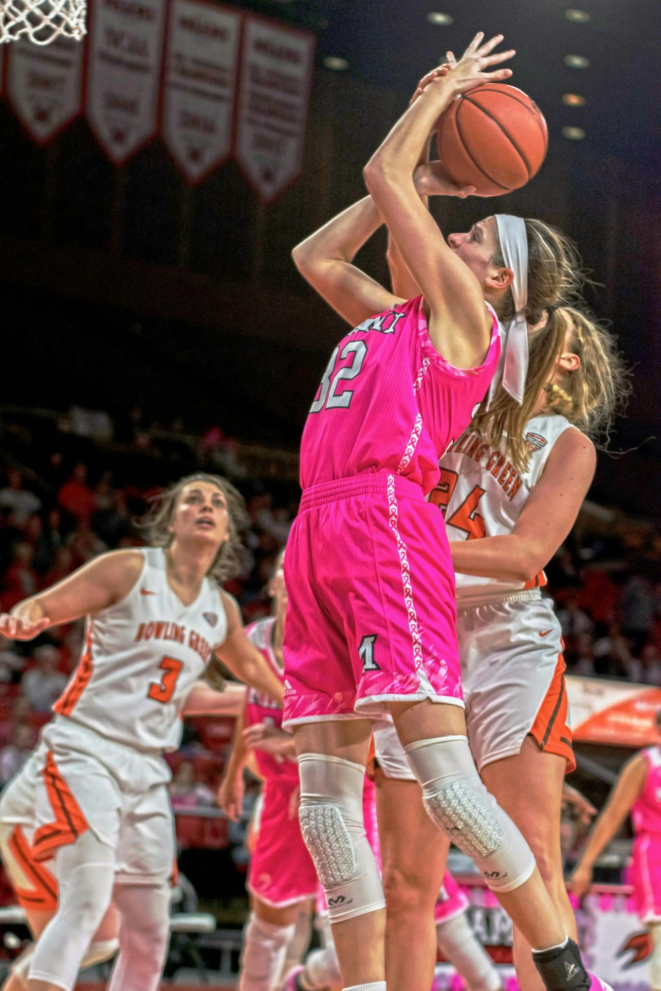
Savannah Kluesner attempts a layup during Miami's 75-62 victory over the Bowling Green Falcons Feb. 23, 2019, at Millett Hall. Kluesner posted an 11-point, 14-rebound double-double.
The all-new alternate uniform this year is a part of the Myaamia Heritage Collection. Instead of going for cream pinstripes, the women’s team opted for a very sleek white uniform with an arched script “RedHawks” — a mark I have not seen from any other Miami team — in red with the ribbonwork design down the sides. From all the uniforms in the collection, I believe this one is the best, and I would even go so far as saying this design would serve as a great template for the primary uniforms moving forward.

Hockey:
The hiring of Miami alum Chris Bergeron as head coach was a widely-accepted move. However, the addition of a new uniform this season has not garnered the same amount of support. Miami hockey completed its second season of wearing new uniforms, which followed the general staples of a Miami hockey uniform. Being year two, the time was right to introduce something new. The RedHawks clearly took to the idea of making something different when creating these alternates.
Miami debuted one of the most bizarre uniforms ever in college hockey. These uniforms break from many of the design principles found in the game. I can find only one jersey at the college level that has ever used pinstripes other than the RedHawks.
If that wasn’t enough, you’ll see the pinstripes are not solid but rather repeat the phrase “The Brotherhood.'' The uniforms try to emulate the Los Angeles Lakers’ 2018 city edition jersey, where their pinstripes used the phrase “3x5xShowtime.” Besides the Lakers, the only other use of words as a stripe in all of high-level sports was in 2014 when the Slovakian national hockey team used its anthem to create stripes for its Olympic uniforms.
The only “normal” features of the RedHawks’ uniform are a red script Miami across the chest and solid red stripes at the elbows.
To be frank, I hate these uniforms. Having bold additions to a uniform just to be different or create buzz almost always fails. From those I asked when these were spotted at the Pro Shop, many said it looked like a baseball uniform more than anything, and I agree.

Soccer:
Opening a new complex last fall also called Miami to make long-awaited updates to uniforms. The traditional red and white is there, but the font has been changed to mirror the updates of other Miami teams in the past few years. The only new addition is different colored sleeves, which helps break up the monochrome look.

Miami soccer is looking for a breakout season in 2022
Softball:
The softball team added only one update, taking the trendy new script Miami and applying it to a sleek all-white uniform.

Overall, while yearning for sports and Miami to go back to normal, I can be happy that designs and the debates continue. Looking forward, it is great to know we will all be stronger after this, and the RedHawks will look better, both competitively and stylistically, once they suit up again.
Read More


Kent State eliminates Miami from the MAC tournament in a 3-1 pitchers duel
By Cooper Meneghetti | May 22, 2026The Miami University RedHawks baseball team suffered a 3-1 defeat at the hands of the Kent State University Golden Flashes. The loss eliminated the RedHawks from Mid-American Conference (MAC) tournament title contention.
Huskies deal RedHawks first defeat of MAC tournament in a 15-inning marathon
By Cooper Meneghetti | May 21, 2026RedHawks drop game one of MAC tournament to NIU